
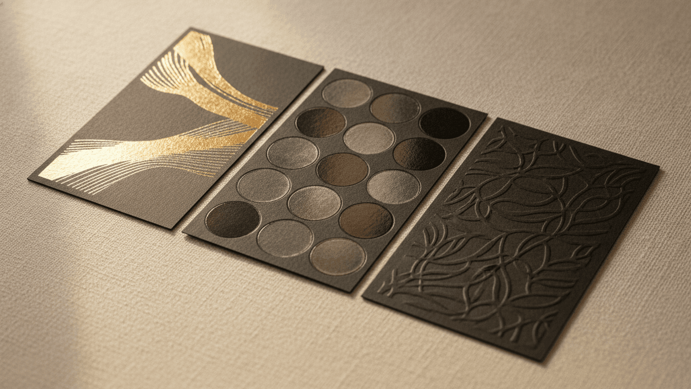
Foil, Spot UV & Embossing: A Guide to Premium Print Finishes
A finish is the difference between a card that gets glanced at and one that gets passed around. Used with restraint, finishes signal craft and confidence.
Foil stamping
Metallic foil catches light and reads as luxury. Reserve it for one element — a logo or monogram — so it stays special.
Spot UV
A glossy, raised coating applied to select areas. It shines against a matte background and adds subtle texture you notice by touch.
Embossing and debossing
Pressing the stock up (emboss) or down (deboss) creates dimension without ink. Beautiful for logos and understated, tactile branding.
Painted edges
A band of color on the edge of thick stock. Unexpected, memorable and surprisingly affordable for the impact.
How to combine finishes
Pick one hero finish and let the rest of the design stay quiet. Multiple loud finishes compete and cheapen the effect. Contrast is what makes a finish sing — matte around gloss, ink around foil.
Proof before you print
Finishes behave differently across stocks. Order a sample or a physical proof so you know exactly how your foil, UV or emboss will land before the full run.
Related articles
 Design Tips
Choosing the Right Paper Stock for Your Print Project
Weight, finish and texture change how your work looks and feels. Here is how to pick the right stock every time.
 Design Tips
The Ultimate Guide to Business Card Design in 2024
Learn the latest trends and best practices for creating memorable business cards that make a lasting impression. Discover typography choices, color psychology, and layout principles.
 Design Tips
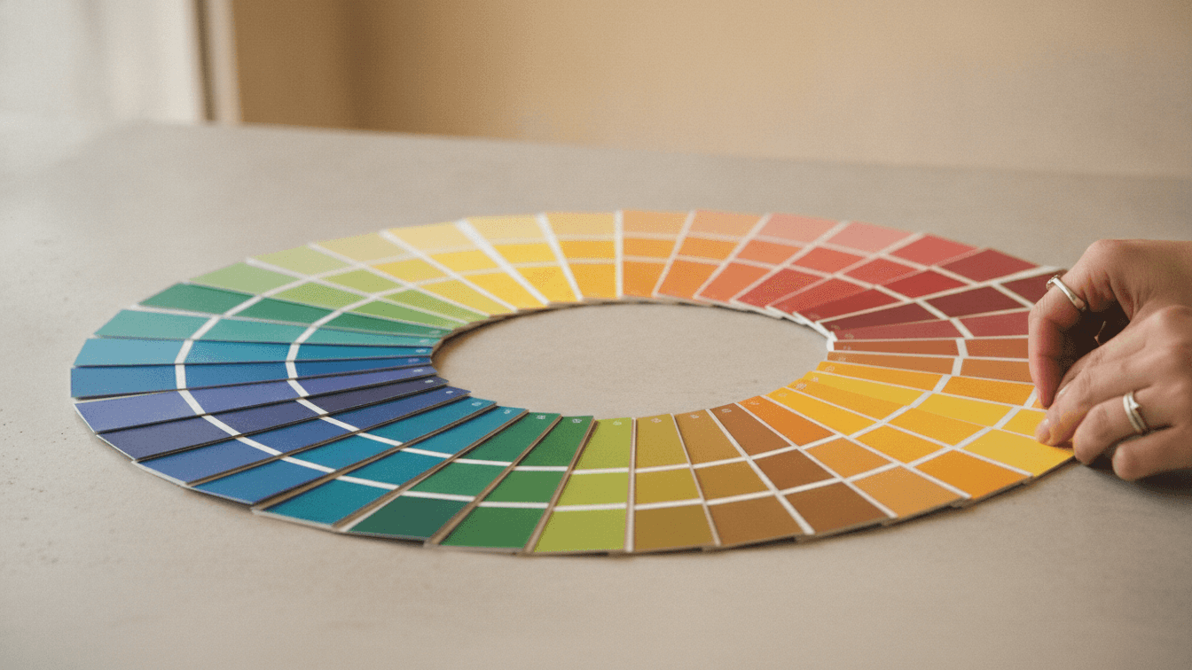
Color Psychology in Print Design
Understanding how colors influence customer behavior and decision-making in your printed marketing materials.