
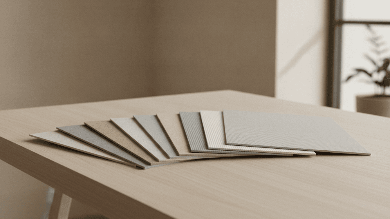
Choosing the Right Paper Stock for Your Print Project
Paper is the first thing people feel before they read a single word. The right stock signals quality instantly — the wrong one undercuts even the best design. Here is a practical way to choose.
Start with weight
Paper weight is measured in pounds (lb) or GSM. Heavier stock feels more premium and stands up to handling.
- Business cards: 16pt–32pt for a substantial, confident feel.
- Flyers and brochures: 100lb text for everyday, 100lb cover for durability.
- Postcards: 14pt–16pt so they survive the mail.
Pick a finish
Finish controls sheen, readability and how colors pop.
Gloss
Vivid color and contrast — ideal for photography and retail promotions. It can glare under bright light.
Matte and uncoated
Soft, modern and easy to write on. Great for a refined, editorial look.
Silk and soft-touch
A middle ground: rich color with a smooth, velvety feel that reads as high-end.
Match stock to the job
A luxury invitation and a grocery flyer have different jobs. Let the goal lead: durability, tactile luxury, writability or punchy color. When in doubt, order a sample kit and feel the options in your hands before you commit.
The quick rule
Heavier and uncoated reads premium and understated; heavier and gloss reads bold and promotional. Choose the pairing that matches the impression you want to make.
Related articles
 Design Tips
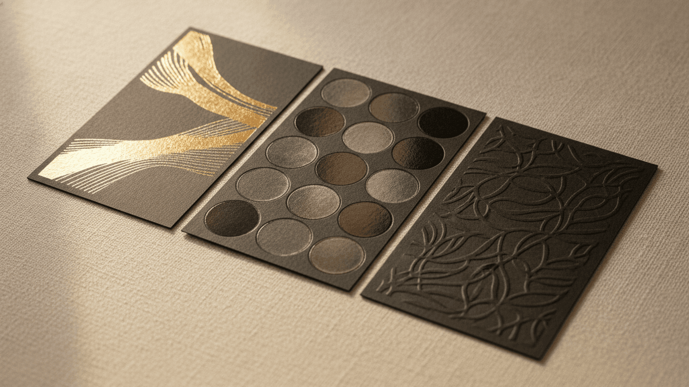
Foil, Spot UV & Embossing: A Guide to Premium Print Finishes
Finishes turn a flat card into something people keep. Here is when to reach for foil, spot UV, embossing and painted edges.
 Design Tips
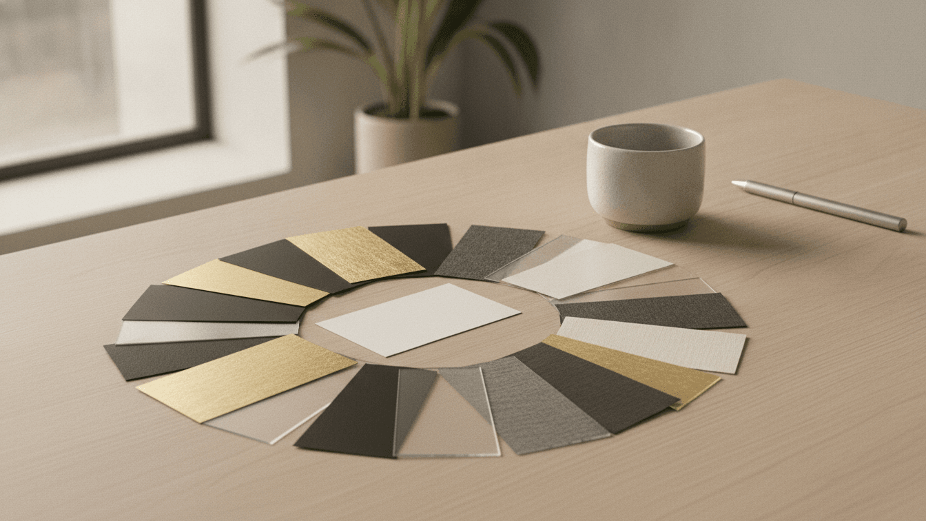
The Ultimate Guide to Business Card Design in 2024
Learn the latest trends and best practices for creating memorable business cards that make a lasting impression. Discover typography choices, color psychology, and layout principles.
 Design Tips
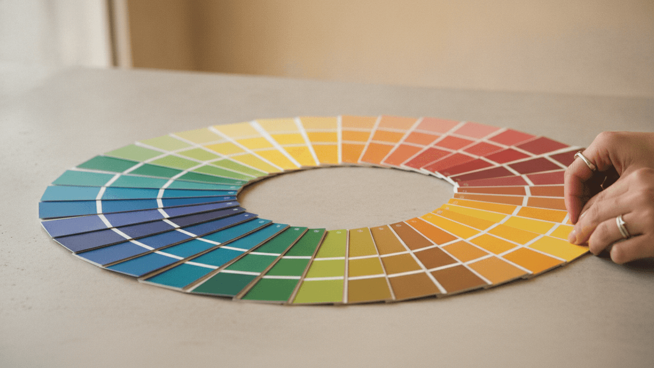
Color Psychology in Print Design
Understanding how colors influence customer behavior and decision-making in your printed marketing materials.