
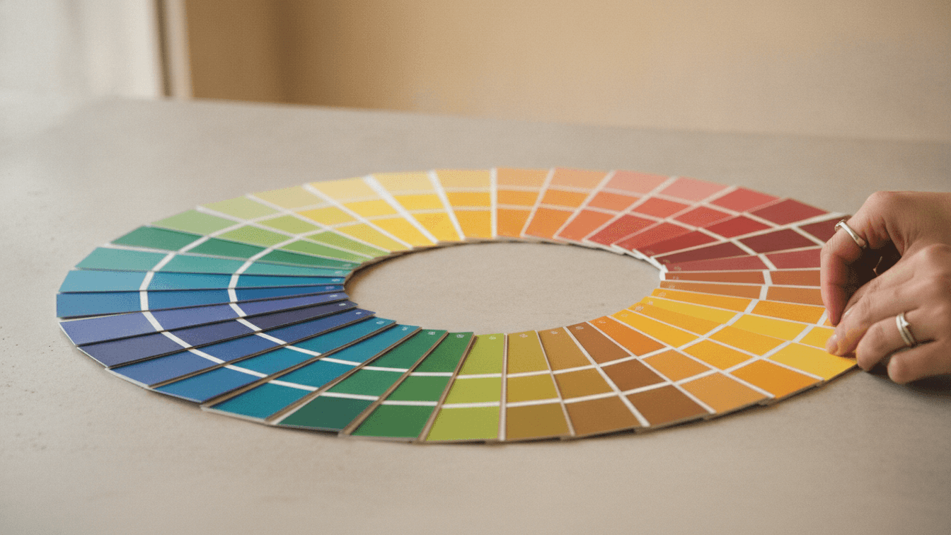
Color Psychology in Print Design
Color is the first thing a reader processes — often before a single word.
What colors signal
Blue reads as trustworthy and calm; red creates urgency; green suggests growth and sustainability. Match the emotion to the message.
Print vs. screen
Always proof in CMYK. Colors that glow on screen can shift noticeably on paper, so request a physical proof for anything brand-critical.
Related articles
 Design Tips
Choosing the Right Paper Stock for Your Print Project
Weight, finish and texture change how your work looks and feels. Here is how to pick the right stock every time.
 Design Tips
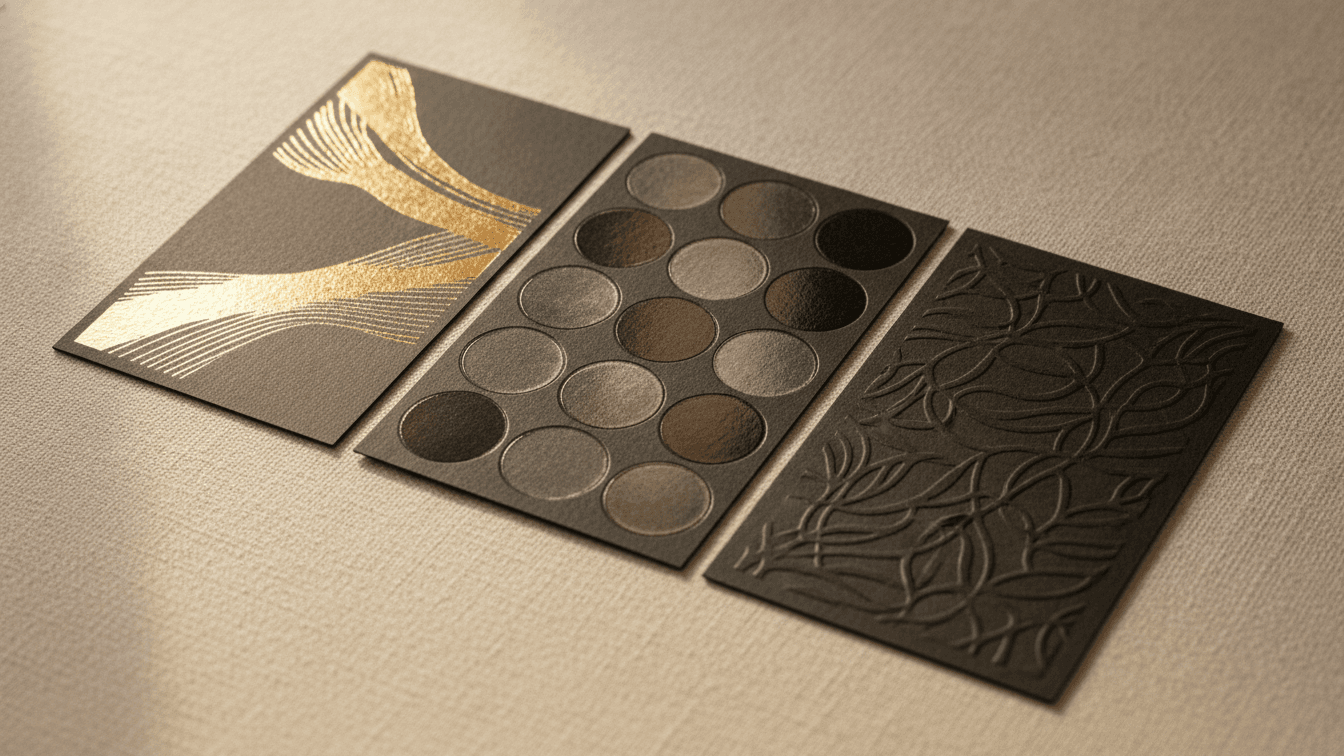
Foil, Spot UV & Embossing: A Guide to Premium Print Finishes
Finishes turn a flat card into something people keep. Here is when to reach for foil, spot UV, embossing and painted edges.
 Design Tips
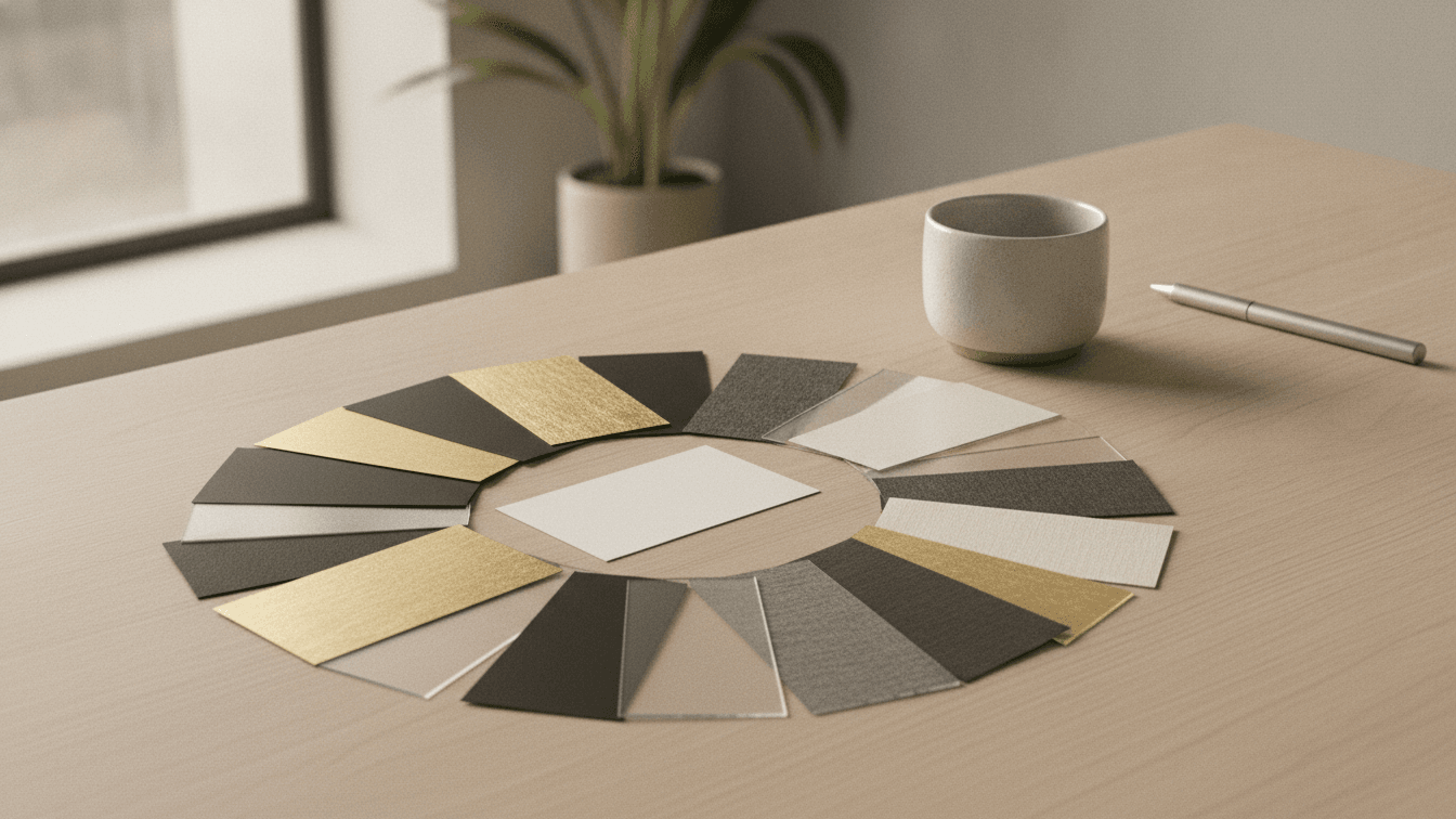
The Ultimate Guide to Business Card Design in 2024
Learn the latest trends and best practices for creating memorable business cards that make a lasting impression. Discover typography choices, color psychology, and layout principles.