
The Ultimate Guide to Business Card Design in 2024
A great business card does more than share contact details — it makes a first impression that lasts. In 2024, the strongest designs pair restraint with one memorable detail.
Typography sets the tone
Choose at most two typefaces: one for your name, one for everything else. Keep body text at 7–8pt minimum so it stays legible after printing.
Use color with intention
Color carries meaning. A confident accent color, used sparingly, reads far more premium than a busy multi-color layout.
Finishing touches
Spot UV, soft-touch lamination, and subtle embossing turn a flat card into something people keep. Pick one finish and let it shine.
Related articles
 Design Tips
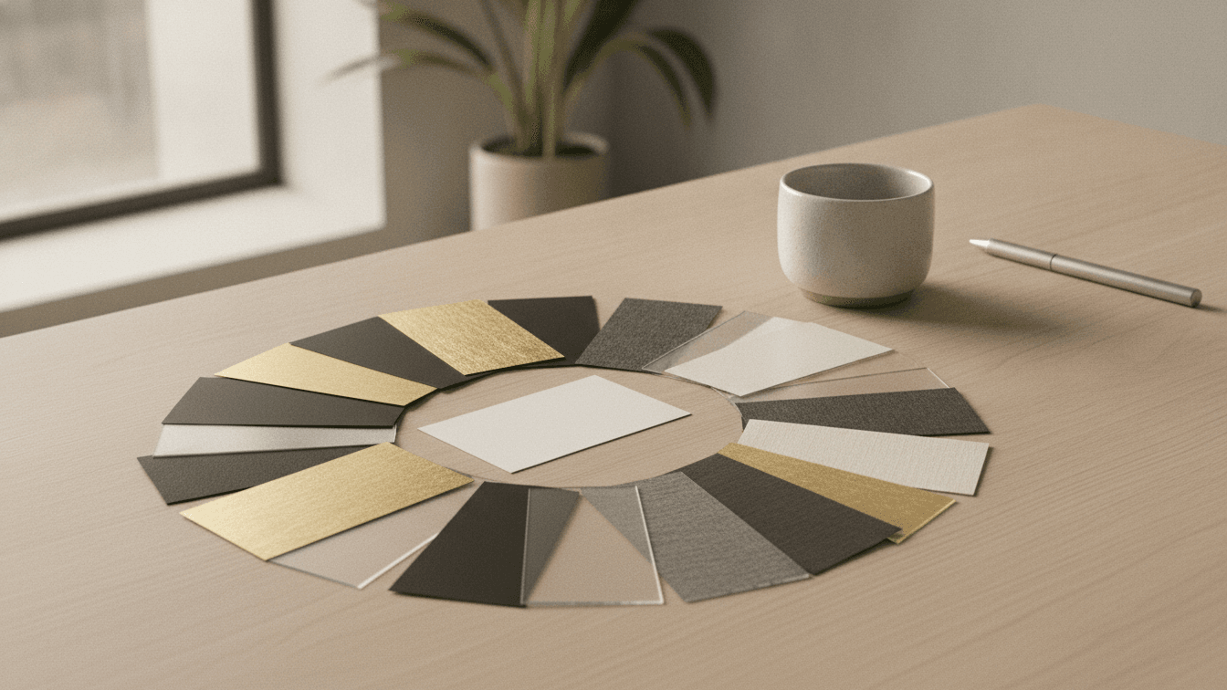
Choosing the Right Paper Stock for Your Print Project
Weight, finish and texture change how your work looks and feels. Here is how to pick the right stock every time.
 Design Tips
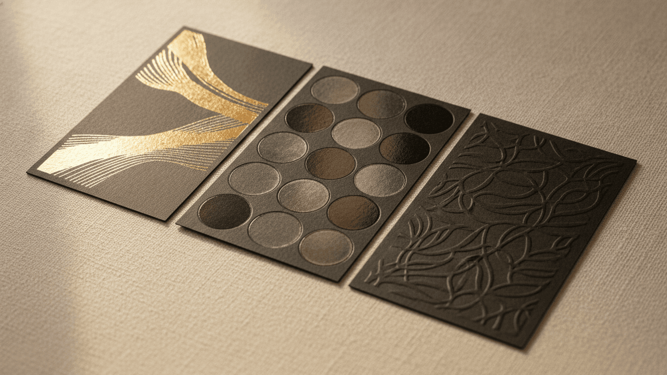
Foil, Spot UV & Embossing: A Guide to Premium Print Finishes
Finishes turn a flat card into something people keep. Here is when to reach for foil, spot UV, embossing and painted edges.
 Design Tips
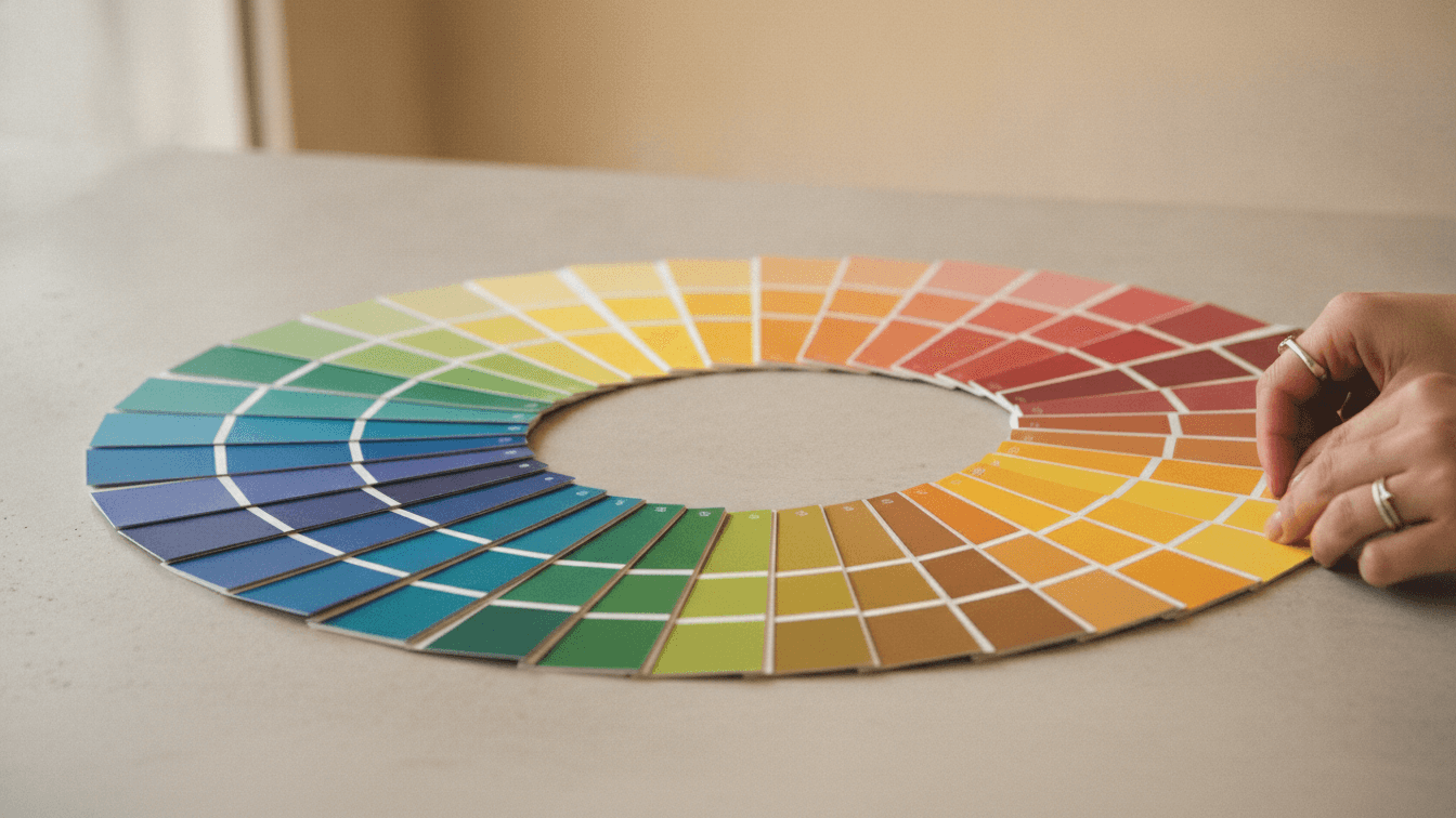
Color Psychology in Print Design
Understanding how colors influence customer behavior and decision-making in your printed marketing materials.